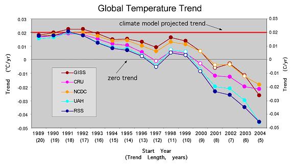
 Chip Knappenberger has written an informative and fair post that clearly explains how global temperature trends look across different datasets and choice of starting dates, and which is summarized in the figure above. Here is Knappenberger's caption to the figure:
Cherry-Pickers Guide to Global Temperature Trends. Each point on the chart represents the trend beginning in September of the year indicated along the x-axis and ending in August 2009. The trends which are statistically significant (p [greater than]0.05) are indicated by filled circles. The zero line (no trend) is indicated by the thin black horizontal line, and the climate model average projected trend is indicated by the thick red horizontal line.Based on this analysis Knappenberger calls out Real Climate and Richard Lindzen for blatant cherry picking:
Knappenberger provides some robust conclusions as well as some examples of creative cherrypicking:Another use of my Cherry-Pickers Guide besides choosing your own analysis, is to check and see what level of cherry-picking was required to support some statement of the behavior of global temperatures that you saw somewhere.
For instance, in a recent post over at RealClimate.org, Stefan Rahmstorf used about 10-yr to 11-yr trend in the GISS dataset to support the idea that global warming was proceeding pretty much according to plan, concluding “the observed warming over the last decade is 100% consistent with the expected anthropogenic warming trend of 0.2 ºC per decade, superimposed with short-term natural variability.”
A quick check of my Guide would show how carefully Rahmsdorf’s selection was made. Trends a few years longer or a few years shorter that the period selected by Rahmstorf would not have borne out his conclusion with as much conviction.
Another example of careful data selection can be found in recent claims made by Richard Lindzen who is fond of stating that “there has been no statistically significant net global warming for the last fourteen years.” A quick check of my Cherry-Pickers Guide shows Lindzen to be particularly crafty because there is no support for such a statement in any of the five datasets. So how did he arrive at that conclusion? By using annual data values instead of monthly data.
Here are a few general statements that can be supported with using my Cherry-Pickers Guide:
• For the past 8 years (96 months), no global warming is indicated by any of the five datasets.
• For the past 5 years (60 months), there is a statistically significant global cooling in all datasets.
• For the past 15 years, global warming has been occurring at a rate that is below the average climate model expected warming
And here are a few more specific examples that the seasoned cherry-picker could tease out:
• There has been no (statistically significant) warming for the past 13 years. [Using the satellite records of the lower atmosphere].
• The globe as been cooling rapidly for the past 8 years. [Using the CRU and satellite records]
Or on the other side of the coin:
• Global warming did not ‘stop’ 10 years ago, in fact, it was pretty close to model projections. [Using the GISS and NCDC records beginning in 1998 and 1999]
• Global warming is proceeding faster than expected. [Using the GISS record staring in 1991 or 1992—the cool years just after the volcanic eruption of Mt. Pinatubo]
I am sure the more creative of you can probably think of many others.